Here are three examples of analysing the designs of some railway images, the first two in language more suited for older learners, and the third in language for younger learners.
EXAMPLE 1

DESIGN ELEMENTS
What do the meanings refer to?
-
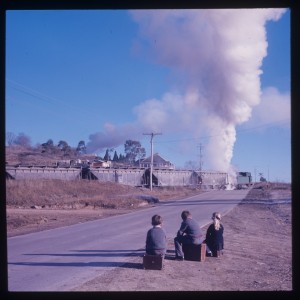
Particular things:the line, form and colour depict children, road and train
- Who: school children, and we don’t know their names, they could be any school children.
- When: the long shadows indicate early morning (and from our experience of waiting for school buses, it’s not likely afternoon because if this were outside the school, there would be more children waiting or if in small groups, less likely to be an age or gender mix); the dead grass and the white steam against the blue sky indicate it is probably winter.
- Where: on the outskirts of a town.
- What: a freight train, school children.
-
General concepts:this image depicts particular things more than general concepts; however, abstract ideas like ‘waiting’ or ‘patience’ might be applied.
- Characteristics: the brown grass, the long shadows, the white steam, the three children, the dusty road.
- Relations: the larger and smaller children imply that they might be siblings, the little locomotive and the large wagons it is pulling, the children’s school cases.
How do the meanings connect the people in the action and the people who are communicating?
- Placement of actors in the image: the children are watching the train, not talking to each other.
- Movement and change: the train is moving across the image from left to right, the children are sitting still, waiting for it.
- The position of the viewer:: we are seeing this from the children’s point of view, not the driver of the train or the person living in the house behind.
How does the overall meaning hold together?
- Arrangement of the image: children in the foreground, train in the middle ground, town in the background.
- Sectioning: bottom = children and road, middle = train, top = sky and town landscape
- Image integration: children beside road + train crossing road conveys an integrated meaning of waiting for the train to pass.
- Prominence: figure = children and train; ground = road, hillside, town, sky
- Realism: a realistic image.
- Media: a photograph, framed through a viewfinder.
- Chaining: the connections between this image the others in a Flickr collection of steam train photographs.
How are the meanings shaped by where they are situated?
- Location of the image: posted for public viewing to a Flickr collection of old train photos.
- Visual references: imagery of childhood and school life, imagery of the past.
- Genre: documentary photography, a ‘decisive moment’ realistic photograph of people’s everyday lives.
Whose interests do these meanings serve?
- The position of the image maker: portraying the feeling of school life and an industrial era that is passing, perhaps nostalgically.
- Inclusions and exclusions: if we were there, we could know how long the train was and whether the bus was yet in sight; the photographer gives us the impression that this train could be long and heavy because they have cut out the end, and because we can’t see a bus, we don’t know how long the wait will be.
- The position of the viewer: evoking empathy with the children, watching the train with interest as they wait for their school bus, as reflected by where the viewer is placed in relation to the scene.
EXAMPLE 2

DESIGN ELEMENTS
What do the meanings refer to?
-
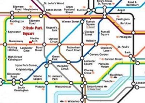
Particular things:the coloured lines for particular underground railway lines, named station ‘Marble Arch’, the address of the destination the red square with the red writing ’2 Hyde Park Square’.
- Where: Central London.
- What: stations, underground railway lines, getting to this destination.
- General concepts: lines mean underground railway lines, dots mean stations, joined dots mean stations where you can change trains, wide light blue line means the river.
- Relations: the order of the stations on each line, the fact that the destination 2 Hyde Park Square is between Marble Arch and Lancaster Gate stations.
How do the meanings connect the people in the action and the people who are communicating?
- Placement of actors in the image: the route that trains take, the order of the stations and points to change train in the underground railway system.
- Movement and change: offering alternative directions, offering the view a chance to interpret direction and design their itinerary.
- The position of the viewer: we are seeing London’s underground railways schematically, from overhead.
How does the overall meaning hold together?
- Sectioning: bottom = south, top = north, left = west, right = east.
- Prominence: destination marked in red.
- Realism: a highly abstract image, not even to scale, the abstraction reducing the spatial meaning of central London to directions and station changes on the London underground. Just two other features are mentioned, the river and the destination.
- Media: a schematic map, not to scale and thus not attempting to provide accurate distances.
- Chaining: this image opens out to a larger map if you want to travel longer distances, or connect station icons with a street map which is to scale.
How are the meanings shaped by where they are situated?
- Location of the image: posted to a website telling people how to get to this destination.
- Visual references: maps, schematic diagram.
- Genre: route maps.
Whose interests do these meanings serve?
- The position of the image maker: telling you how to get to their destination, how easy it is to get to, how well located it is.
- Inclusions and exclusions: leaves out all the detail of streets, buildings, other addresses, landmarks etc. of this part of London; how to get to this destination from places outside of the stations that are depicted.
- The position of the viewer: an objective view of underground train line directions, stations and places where people can change lines.
EXAMPLE 3

Following is a version of image design analysis phrased for younger learners, followed by an example in the form of a third train picture.
|
For Younger Learners |
|
|
REFERENCE |
What is the picture about?
|
|
INTERACTION |
How are people or things doing things together?
|
|
COMPOSITION |
How does the picture hang together?
|
|
CONTEXT |
How does the picture connect with things around it?
|
|
PURPOSE |
What is the picture for?
|
Table 9.2: Visual Design Elements, for Younger Learners
What is the picture about?
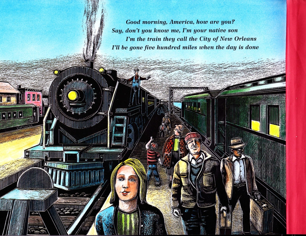
- The things you can see in the picture: train, people, railroad station.
- What the picture says about the things it is picturing: the train is large compared to the people, the people are wearing coats and have bags.
- How things are related: the train is beside the platform, at the end of the railway line.
How are people or things doing things together?
- How people are connected in the image: the child is waving goodbye to the driver, the parent is watching them wave, the other people have their backs to the train because their journey has ended and they are walking out of the station.
- How the viewer sees the image: the viewer is looking back at the train the same way as the small child on the platform, except we are also noticing the people leaving at their journey’s end.
How does the picture hang together?
- How the picture is put together: The platform is in the middle of the picture, surrounded by trains, station and the city of New Orleans.
- What stands out: the large locomotive at the front of the train and the people leaving.
- Realism: not as realistic as a photograph, but more realistic than a cartoon.
- How the picture is made: a black and white etching or linocut coloured with watercolour.
- How this picture is connected with others: in a children’s story book.
How does the picture connect with things around it?
- How the picture makes sense where you find it: it is the last picture in a children’s story book about a train journey.
- How the picture is like other things you can see in the world: what you’ve seen of trains, travellers and railroad stations.
- How the picture is like other kinds of picture: it feels like an illustration in a children’s storybook.
What is the picture for?
- Who made the picture and why: a children’s storybook writer, to give them the feeling of a train ride in the past, to entertain children, to connect children with their parents or grandparents who might be reading the story, to sell books.
- What the author wanted you to feel: what train travel was like in the past, from the perspective of the child waving goodbye to the driver.
Goodman, Steve and Michael McCurdy. 2003. The Train they Call the City of New Orleans. New York: C.P. Putnam and Sons.
